Typography
Grade: 7
During the Typography course, I explored how letterforms, style, and design influence the way information is communicated. Throughout this project, I completed various assignments in which I analyzed, researched, and applied typography in my own designs.
During the Typography course, I explored how letterforms, style, and design influence the way information is communicated. Throughout this project, I completed various assignments in which I analyzed, researched, and applied typography in my own designs.
Assignment 1: City Walk
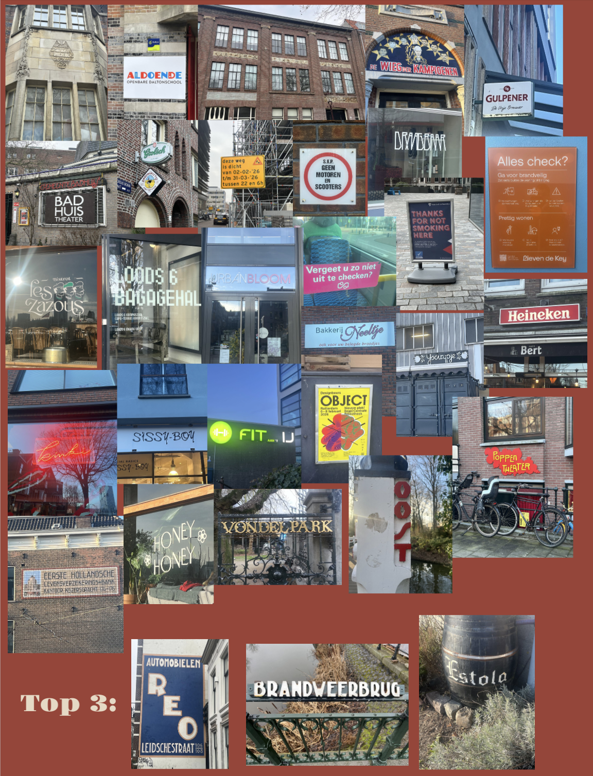
For this assignment, I completed a City Type Walk, during which I explored typography in public spaces. During the walk, I took a total of 30 photographs of different forms of typography that I encountered in my surroundings.
From these photographs, I selected 15 examples of neutral typography and 15 examples of expressive typography. Neutral typography primarily focuses on readability and functionality, while expressive typography is intended to convey a specific atmosphere, emotion, or identity.
After collecting the photographs, I selected the three most interesting examples. I evaluated them based on aspects such as design, readability, visual appeal, and how well the typography related to its environment. One of these selected examples then served as the foundation for the next two assignments. As a result, the City Type Walk was not only an exploration of typography in public spaces but also the starting point for the further development of this project.
Assignment 2: Good Time Date
For this assignment, I designed an A5-sized calendar page based on a self-selected typographic example from the City Type Walk. I chose the Neude typeface and conducted additional research into its typographic characteristics and visual identity.
Research
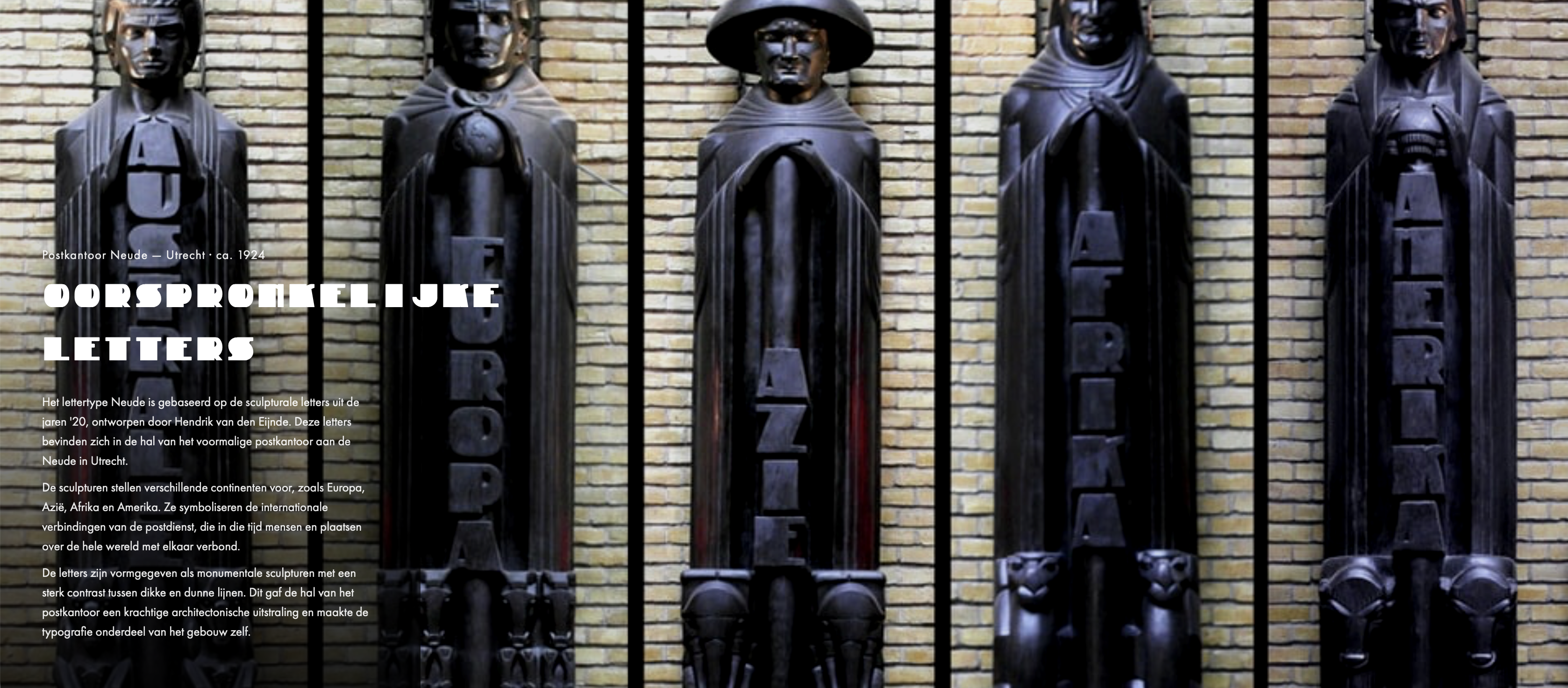
The Neude typeface is based on the style of the Amsterdam School and is inspired by the sculptures of Hendrik van den Eijnde in the former post office building at Neude in Utrecht. This art and architectural movement emerged at the beginning of the twentieth century and is known for its expressive forms, decorative details, and strong focus on typography. Within Amsterdam School architecture, attention was not only given to buildings themselves but also to smaller visual elements such as facade lettering, ornaments, and house numbers. These characteristics served as an important source of inspiration for the design of the Neude typeface.
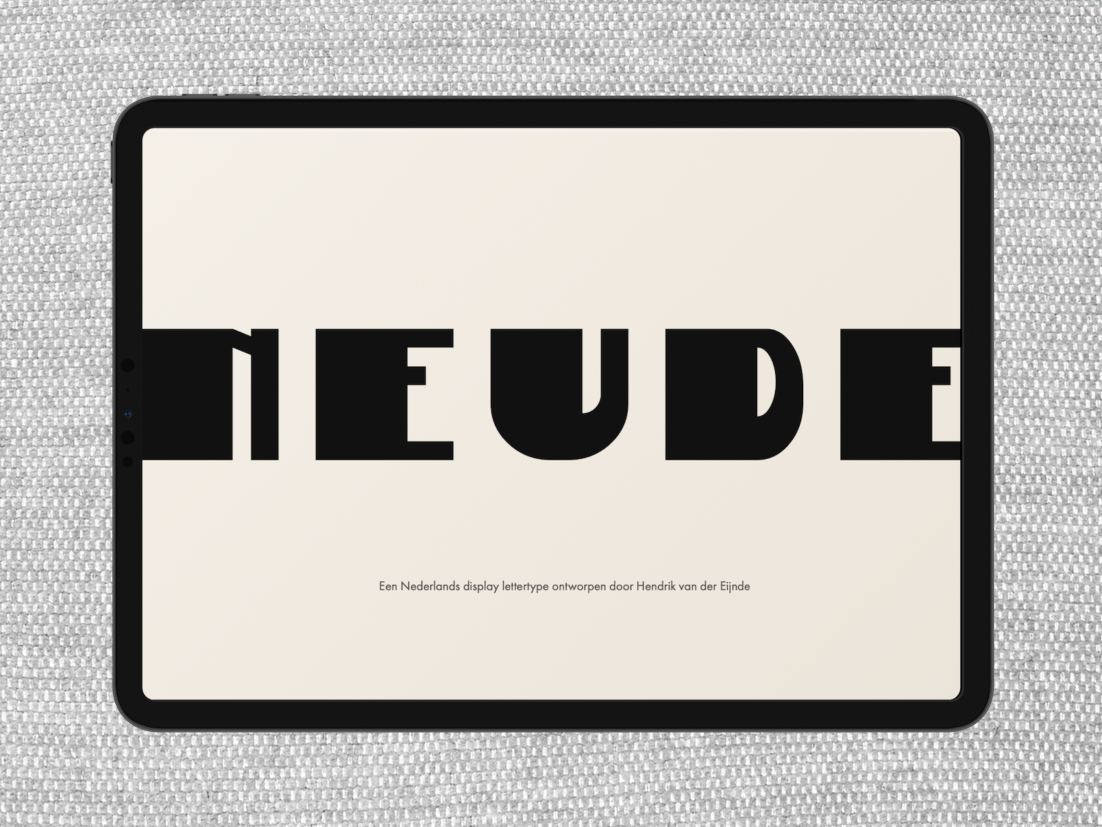
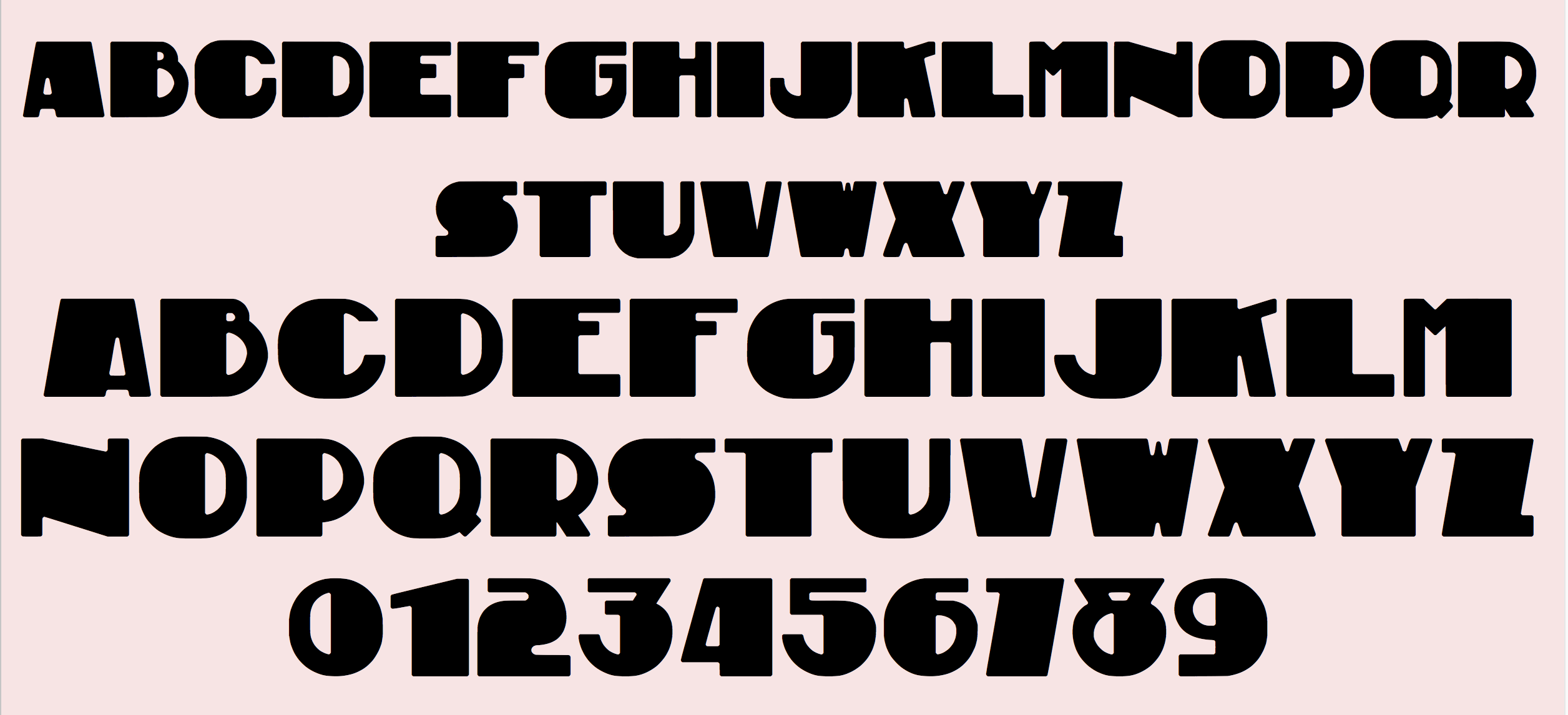
The typeface is characterized by an Art Deco style with a strong contrast between very thin and thick strokes. This clear difference in stroke weight gives the typeface a distinctive and expressive appearance. The letterforms are often geometric and decorative, resulting in a strong visual identity. Because of these characteristics, the typeface is less suitable for long passages of body text but ideal for headings, titles, and posters where typography plays a prominent visual role.
Neude is a display typeface, meaning it is primarily intended for larger text sizes and is less suitable for body text. For this reason, I combined Neude with Futura in my type specimen. Like Neude, Futura originated in the 1920s. In addition, Futura is also a geometric typeface, but its simple and balanced letterforms make it much more readable in longer texts. As a result, Neude and Futura form a suitable combination within my design.
Calendar Page Sketches
Before creating the final design, I produced several hand-drawn sketches. In these sketches, I experimented with different compositions, formats, and placements of the date to determine which layout worked best.

A5 Calendar Page
Based on the sketches, I designed a final calendar page featuring my birthday using the Neude typeface. During the design process, I focused on hierarchy, readability, and an appealing visual presentation.

Type Specimen
For the Type Specimen assignment, I designed and developed an interactive website centered around the Neude typeface. The goal of this project was to present the characteristics, history, and applications of the typeface in an engaging and accessible way. Particular attention was given to typography, visual hierarchy, and user experience. Through animations, interactive elements, and consistent visual design, visitors are guided step by step through the story behind the typeface.
View the complete Type Specimen via the link below:
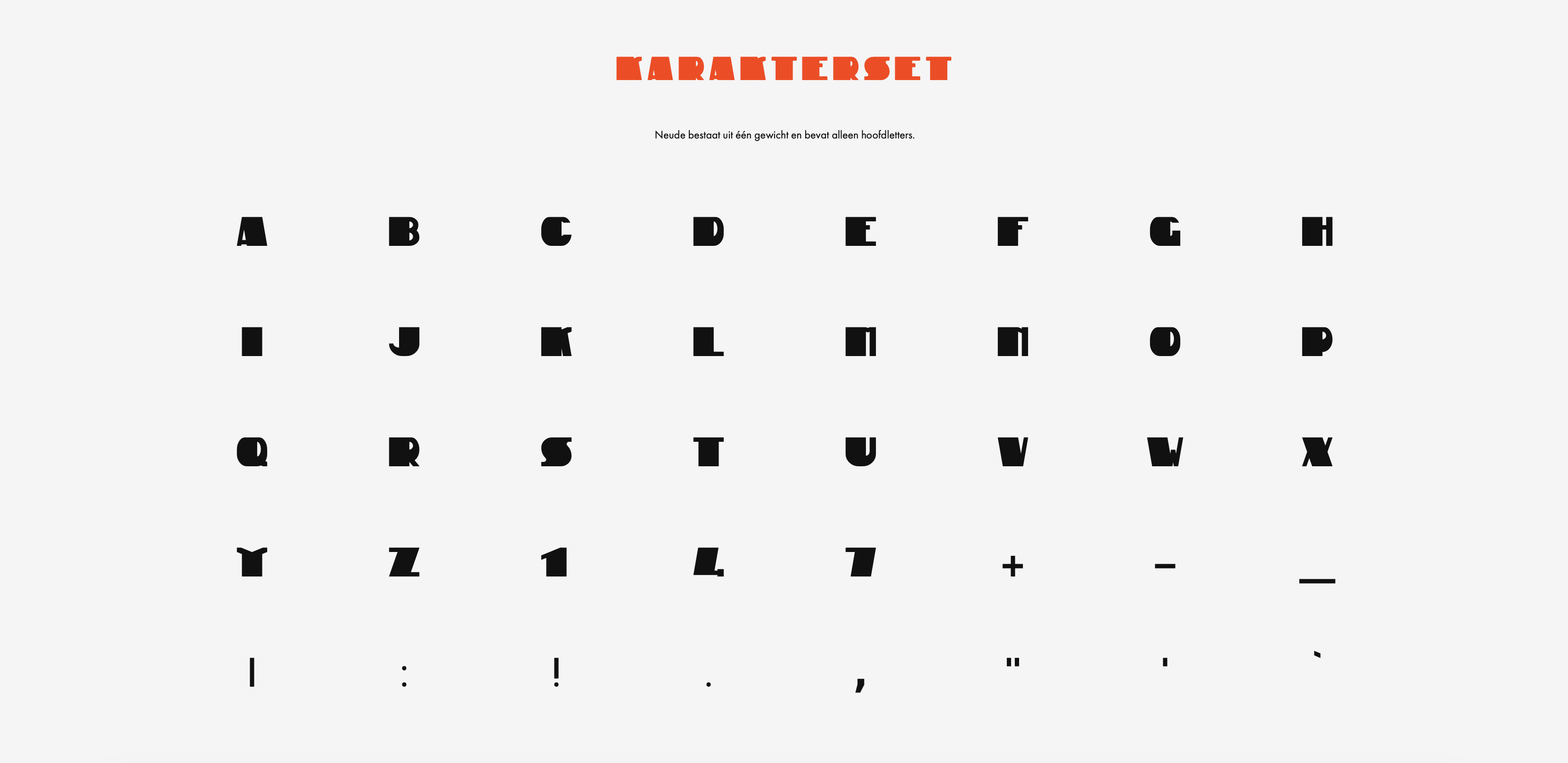
https://ziyasensoy.github.io/neude-type-specimen/Character Set
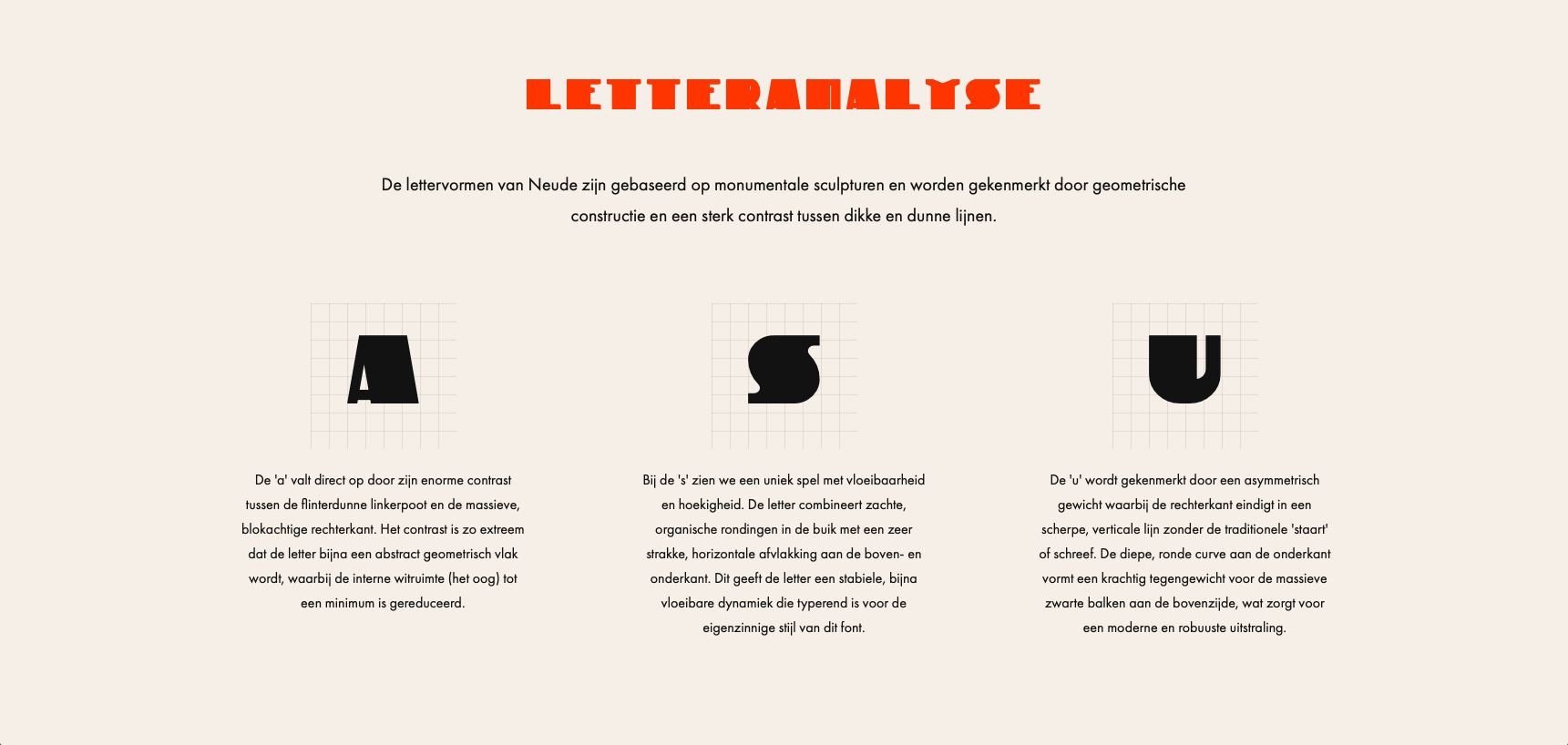
Letter Analysis
Origin