Color and Composition
Final Grade: 7
Within the Color and Composition course, I learned how color usage, visual hierarchy, and composition contribute to an effective user experience. This project focused on creating a consistent visual identity, where both aesthetics and usability played an important role.
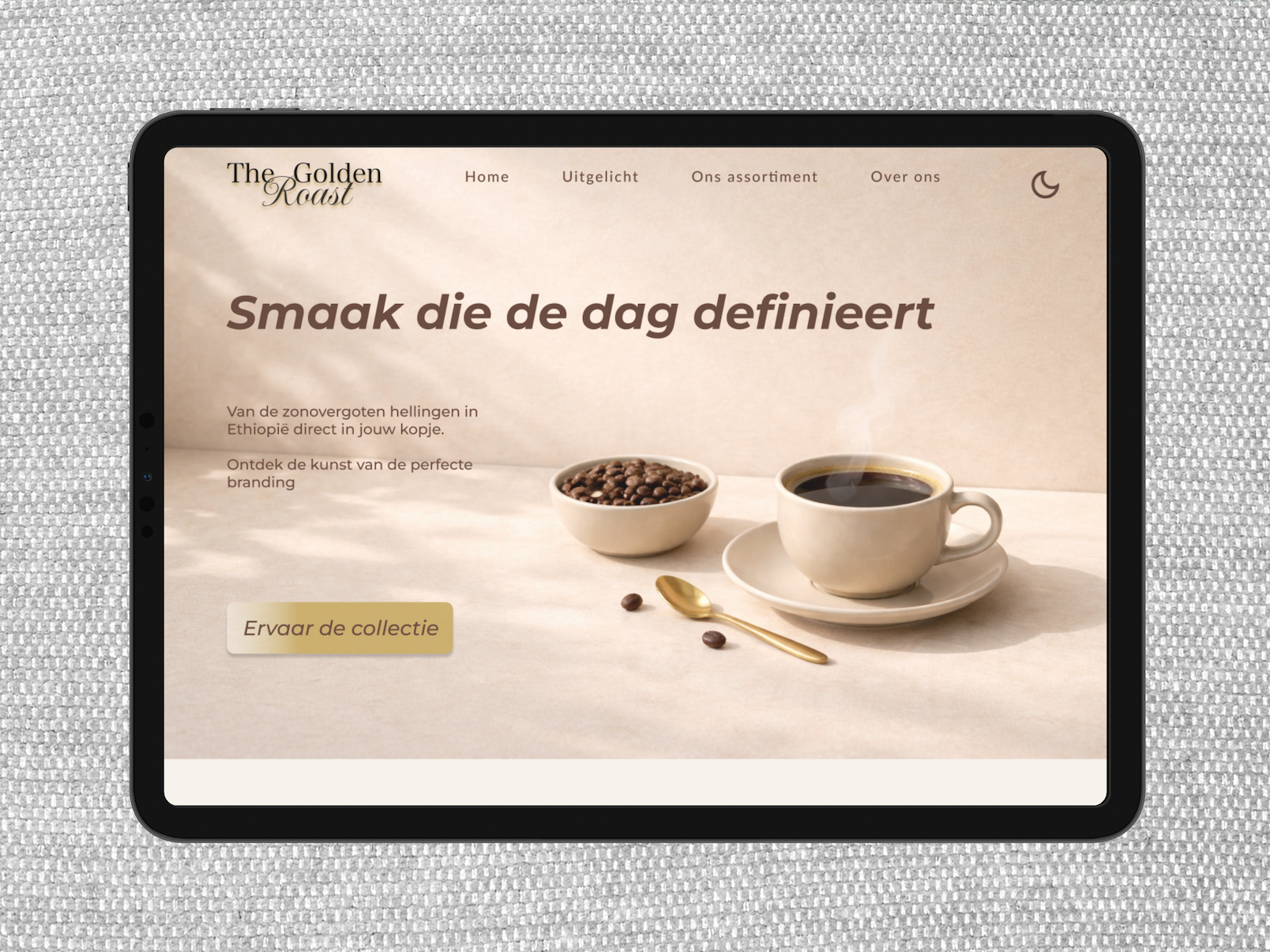
For this assignment, I created designs for the luxury coffee brand The Golden Roast. The project consisted of designing a landing page and a user dashboard. Both designs were developed based on a predefined persona: Mark, a loyal customer who values convenience, familiarity, and a warm brand experience.
Mark usually purchases the same coffee blend and wants to quickly and easily reorder his favorite products. Therefore, the dashboard focused on efficiency and clarity. Key features, such as viewing his loyalty status and quickly reordering his favorite coffee beans, were given a prominent place within the interface.
Branding & Color Psychology
For the design, I selected a color palette that matches the feeling of a premium coffee experience and the needs of the persona. In light mode, Ivory Cream (#F6F1EA) serves as the primary color, complemented by Mocha Brown (#5C3A2E) and Warm Gold (#C6A75E) as accent colors. This combination creates a light, warm, and inviting appearance that fits a relaxed coffee experience.
For dark mode, I chose Mocha Brown (#5C3A2E) as the dominant color. This gives the interface a calmer feel in darker environments. By combining it with light text in Ivory Cream (#F6F1EA) and accents in Warm Gold (#C6A75E), the contrast remains strong and important elements stay clearly visible. As a result, the dark mode feels both functional and luxurious.
Visual Hierarchy & Composition
When designing the landing page, I used a clear visual hierarchy to guide the user's attention to the most important elements. The layout follows an F-pattern, where the eye is first drawn to the logo and dark mode toggle, then to the title and introductory text, and finally to the atmospheric image.
The most important element on the page is the call-to-action button, “Experience the Collection.” This serves as the primary interaction point for the user. I used a column grid for the layout, ensuring that all elements are consistently aligned. The combination of structure, balance, and sufficient white space contributes to a premium and high-end appearance.
Data Visualization (Flavor Radar)
For the flavor radar, I chose the axes Balance, Body, Sustainability, Purity, Aroma, and Complexity. These terms are commonly used within the coffee industry and are therefore familiar to the target audience. By visualizing these characteristics, users can quickly gain insight into a coffee's flavor profile.
The radar shows that the featured coffee scores particularly high in body and purity, complemented by strong ratings in aroma and complexity. This allows users to understand the coffee's key characteristics at a glance, without having to read extensive product descriptions.
Figma Techniques
During the design process, I made extensive use of Auto Layout and Components. I applied Auto Layout to elements such as the navigation bar, text sections, buttons, and footer. This ensured that spacing and alignment remained consistent, even when content was modified.
In addition, I used Components for reusable elements such as cards, the navigation bar, and the footer. This made my workflow more efficient and helped maintain a well-organized file structure. I also considered accessibility by ensuring sufficient contrast, such as Mocha Brown (#5C3A2E) on Warm Gold (#C6A75E), combined with clear typography and ample white space. As a result, the design meets WCAG AA accessibility guidelines.
Reflection
During this assignment, I discovered how important a well-structured Figma file is for an efficient design process. At first, I frequently positioned elements manually, which sometimes led to inconsistent spacing and made layout adjustments more time-consuming.
By using Auto Layout more consistently, the structure of the design remained organized and updates became much easier to implement. This not only improved my technical skills in Figma but also taught me the importance of scalability and consistency in interface design.