Visual language
Grade: 7.5
Within the Visual Language course, I explored how visual elements can be used to convey meaning and communicate a message effectively. Throughout the various assignments, the focus was not only on creating designs but also on understanding the theory behind visual communication. I learned how images, shapes, colors, and compositions influence the way a message is interpreted by an audience.
During the course, I worked with topics such as semiotics, Gestalt principles, and visual rhetoric. Giving and receiving feedback also played an important role in the design process. By analyzing, justifying, and improving designs, I learned to make more deliberate design decisions and connect them to both theoretical principles and the intended message and target audience. This gave me a better understanding of how visual language can be used to communicate information in a clear, engaging, and persuasive way.
Assignment 1: Semiotics
For this assignment, I explored how the meaning of an object can change when it is placed in different contexts and atmospheres. By using suitable backgrounds, visual elements, and indexical signs, the same object can be interpreted in different ways. The goal of this assignment was to demonstrate how context influences the meaning of an image and how visual choices can strengthen a story.
For this assignment, I chose a key as the central object. The key appears in three different scenes, each time taking on a different role and meaning through the context and atmosphere in which it is placed. As a result, each visual creates a different interpretation of the same object.
In addition, I deliberately used an indexical sign in each scene to strengthen the story. Because the context differs in every scene, the indexical sign also changes. In this way, I explored how visual language, atmosphere, and context together influence the meaning that viewers assign to an object.
Scene 1: Moving House

Scene 2: Prison

Scene 3: Driving a Car

Assignment 2: Rhetoric & Gestalt
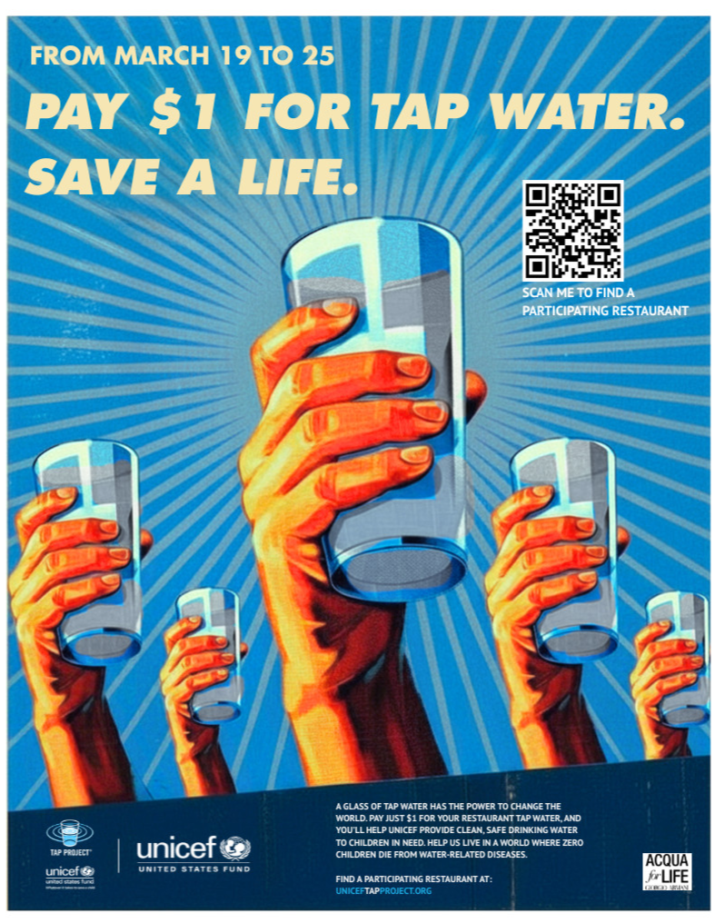
For this assignment, I analyzed an existing awareness campaign and examined how different visual techniques are used to communicate a message persuasively. I selected a poster from the UNICEF Tap Project, a campaign that raises awareness about the importance of clean drinking water for children around the world.
The poster appealed to me because of its strong message and the visual unity created through the repetition of hands and glasses of water. During my analysis, I examined rhetorical elements such as ethos, pathos, logos, and kairos, as well as stylistic devices, indexical signs, framing, and Gestalt principles. I then created an improved version of the poster in which I made several adjustments to make the message even more persuasive.
For example, I made the glasses less full and the water more cloudy, making the issue of water scarcity immediately visible. I also changed the slogan to “Pay $1 for tap water. Save a life.” and added a clear call to action. These changes create a stronger emotional impact and encourage the viewer to take action.

Final Assignment
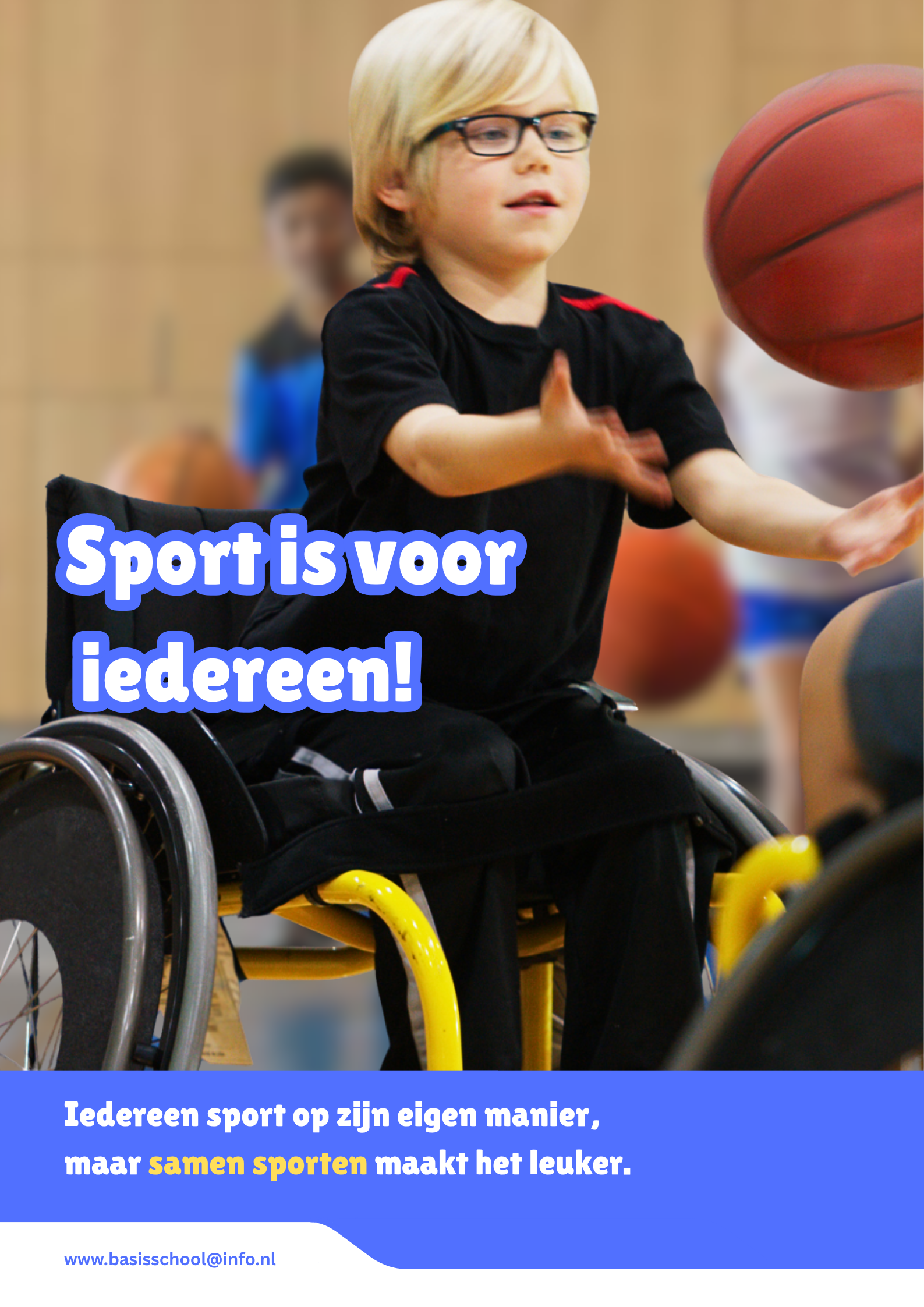
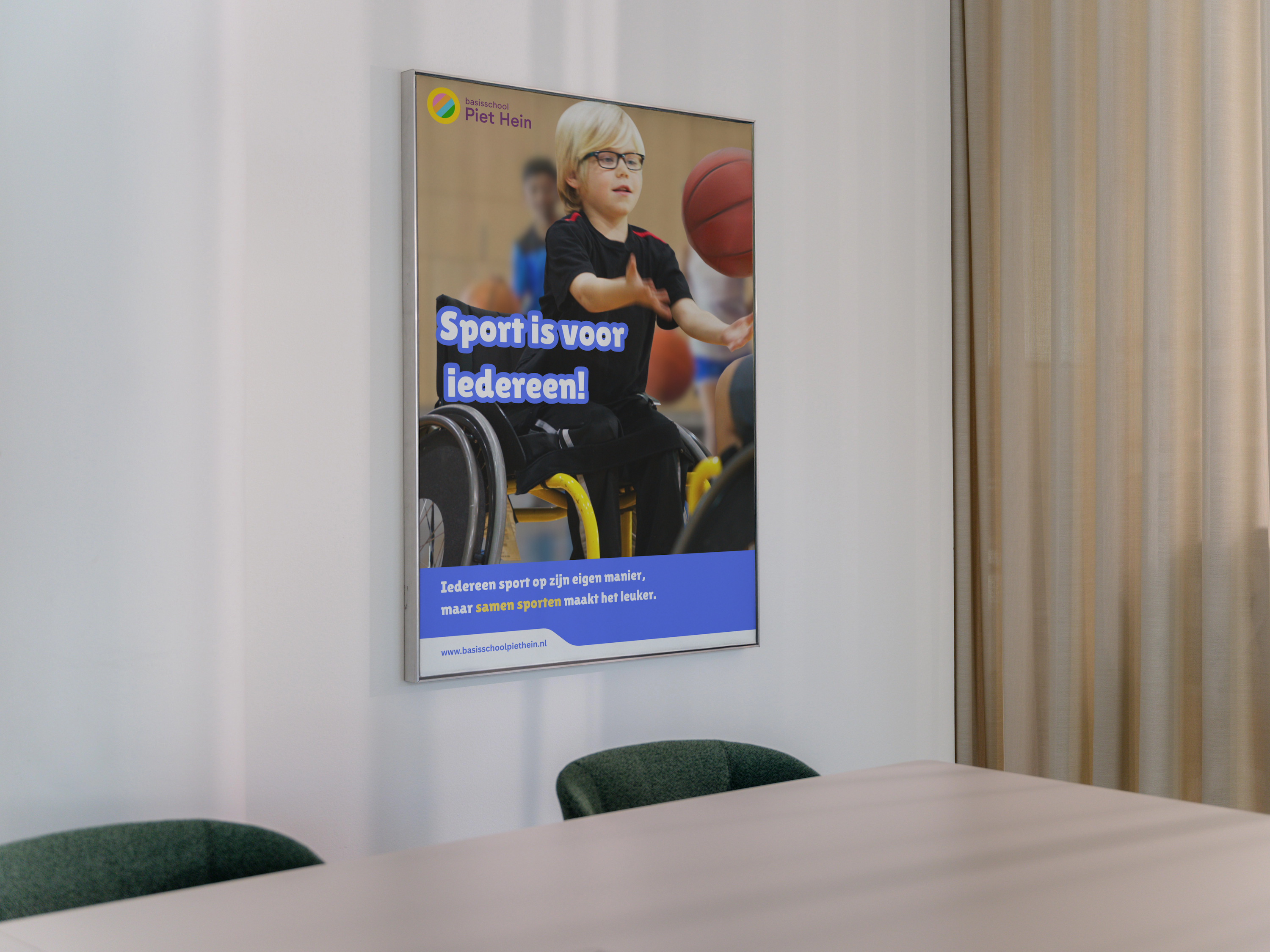
For the final assignment, I designed an awareness poster in which I applied theories from semiotics, rhetoric, and Gestalt. I chose the theme of inclusion in sports because I believe everyone should have the opportunity to participate, regardless of any disabilities.
The poster is primarily aimed at elementary school children. Therefore, I chose a child as the main character so that the target audience could easily identify with the image. I also used a simple and clear message: “Sports are for everyone!” With this poster, I wanted to raise awareness about the fact that children with disabilities are sometimes excluded from sports activities and show that sports can be accessible to everyone.
Within the poster, I applied principles from semiotics, rhetoric, and Gestalt. The wheelchair functions as an indexical sign referring to a physical disability, while the child playing sports demonstrates that everyone can participate. Through the use of pathos, ethos, and logos, the message is communicated persuasively and connects to the current theme of inclusion. In addition, Gestalt principles such as proximity, repetition, and color contrast contribute to a clear and well-structured design that suits the target audience.